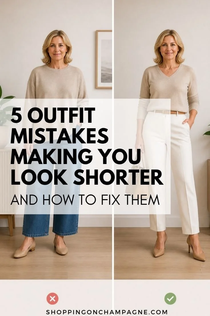
10 Color Mistakes that Make Clothes Look Cheap
You may be shocked to hear, color is one of the fastest ways an outfit can look expensive and modern, or a little cheap and dated, and it has nothing to do with your age or your budget. I’ve seen $300 pieces look bargain-bin simply because the color choices were working against them. And I’ve seen very affordable pieces look elevated because the color was handled in a smarter way.
So if you’ve ever put on an outfit and thought, “Why doesn’t this feel polished?” there’s a good chance color is part of the answer. Not the color itself, but how it’s being used.
Let’s walk through ten color mistakes that make clothes look cheaper, and the simple fixes that make outfits look instantly more refined.
1. Wearing a color that clashes with your skin tone
A color can be beautiful on the hanger and still make you look washed out or sallow once it’s on. When that happens, the whole outfit can feel off, even if everything fits perfectly.
The fix is to pay attention to your face first. If a color makes your skin look brighter, your eyes clearer, and your face more alive, it’s a keeper. If it dulls you out, it will dull the outfit too. You don’t need a complicated color system. You just need to notice what lights you up.

2. Too much harsh contrast right under your face
High contrast can be gorgeous, but when it’s too hard right at your neckline, it can look severe instead of chic.
The fix is softening the contrast near your face. If you love black and white, try cream instead of bright white. If you love bold colors, keep the strongest contrast lower on the body and let your neckline be gentler. It reads more modern and more flattering.
3. Wearing a “blah” neutral with no dimension
Not all neutrals are created equal. Some neutrals look rich and intentional, and some look flat and tired.
The fix is adding depth through tone or texture. Instead of one flat beige, mix a warm camel with a cream. Instead of head-to-toe gray, add charcoal with a softer heather. The slight shift makes the outfit look more expensive without adding any color at all.
4. Pairing colors that don’t belong in the same mood
This is a subtle one. Sometimes colors technically “match,” but the mood feels off. Think a dusty, muted sweater with a bright, neon accessory. They’re both fine, they just don’t live in the same world.
The fix is matching “energy,” not just color. Muted with muted. Bright with bright. Soft with soft. When the mood of the colors lines up, the outfit looks cohesive and elevated.
5. Wearing a bright color with no anchor
A bright color can be a great modernizer, but if it’s floating by itself with no supporting neutral, it can look a little random.
The fix is anchoring it. Let the bright color have a neutral partner. A bold top with clean denim. A bright skirt with a neutral knit. A strong shoe with a simple outfit. That anchor makes the bright color look intentional instead of loud.
6. Overdoing trendy colors that don’t feel like you
Trendy colors can be fun, but wearing a head-to-toe trend shade that doesn’t suit you can make the outfit feel like a costume.
The fix is using trendy color as an accent, not a takeover. If you love a trend color, bring it in through a shoe, a scarf, a top, or a bag. One hit of trend feels modern and fresh. Too much feels forced.
7. Mixing too many colors at once
When an outfit has four or five competing colors, the eye doesn’t know where to land. The result is busy, not polished.
The fix is narrowing your palette. Two to three colors maximum is the easiest rule. A neutral base plus one accent color, or two related tones plus a neutral. It instantly makes outfits look more refined.
8. Wearing color that’s faded or tired
Even a great color looks cheap when it’s worn out. Faded black, washed-out navy, dull whites, tired brights. It makes the whole outfit feel neglected.
The fix is simple honesty. If a piece has lost its color life, either refresh it or retire it. Fresh color reads fresh outfit. It matters more than people realize.
9. Putting the wrong color in the wrong place
Some colors make you want to look at them. If that color is placed in a spot you don’t want attention, it can throw off the whole look.
The fix is strategic placement. Put your strongest, happiest color near your face or where you want the eye drawn. Keep softer tones where you want less emphasis. It’s not about hiding anything. It’s about directing the outfit where you want it to go.
10. Forgetting that monochrome needs texture
Monochrome can look incredibly chic and expensive, but if everything is the same exact tone and the same exact fabric, it can fall flat.
The fix is mixing textures and slightly different tones within the same color family. Cream with camel. Black with charcoal. Navy with denim. Same family, different depth. That’s what makes monochrome look modern instead of old-fashioned.
The quick way to make color look expensive
If you want a simple checklist, try this:
Choose colors that brighten your face.
Keep your palette to two or three tones.
Anchor bold colors with neutrals.
Add texture or tone shifts in monochrome looks.
Refresh tired, faded color when it stops serving you.
Those five moves make almost any outfit look more elevated.
Want help with this?
If you are ready to stop guessing and start making real progress, I have tools that will walk you through every step of this journey. Whether you are just getting started, ready to build a wardrobe that truly works for your life, or want a fully personalized experience, I have something for you at every level.
You can find all of them linked below.👇

Color isn’t about rules, it’s about results
You don’t need to be fearless with color. You don’t need to be a color expert. You just need to notice what makes you look alive and what makes an outfit feel intentional. When color is used with a little thought, everything you wear looks more modern, more polished, and more expensive, even if you didn’t spend much.
Which color mistake do you think you slip into most, too many colors, tired neutrals, or harsh contrast? Let me know in the comments, you know I love hearing from you. Stay gorgeous.